Flow in the Kitchen: this is not a cookbook!
Thank you so much for accepting to give me feedback about the possible book covers for my upcoming book: Flow in the Kitchen: Practices for Healthy Stress-free Vegan Cooking.
Before you answer the poll, I feel that I should warn you that this is NOT a cookbook. It’s more about the methodology and philosophy of cooking, along the lines of my Find Joy in the Kitchen materials, my instructions (but not recipes) to improvise balanced plant-based meals, and my approach to meal planning and batch cooking. More like a way of thinking about vegan cooking and how to make it flow into the rest of your life.
Kindly keep that in mind when choosing a cover that talks to you!
If you haven’t yet read the DRAFT preface and intro of the book, you can do so here.
THANK YOU!
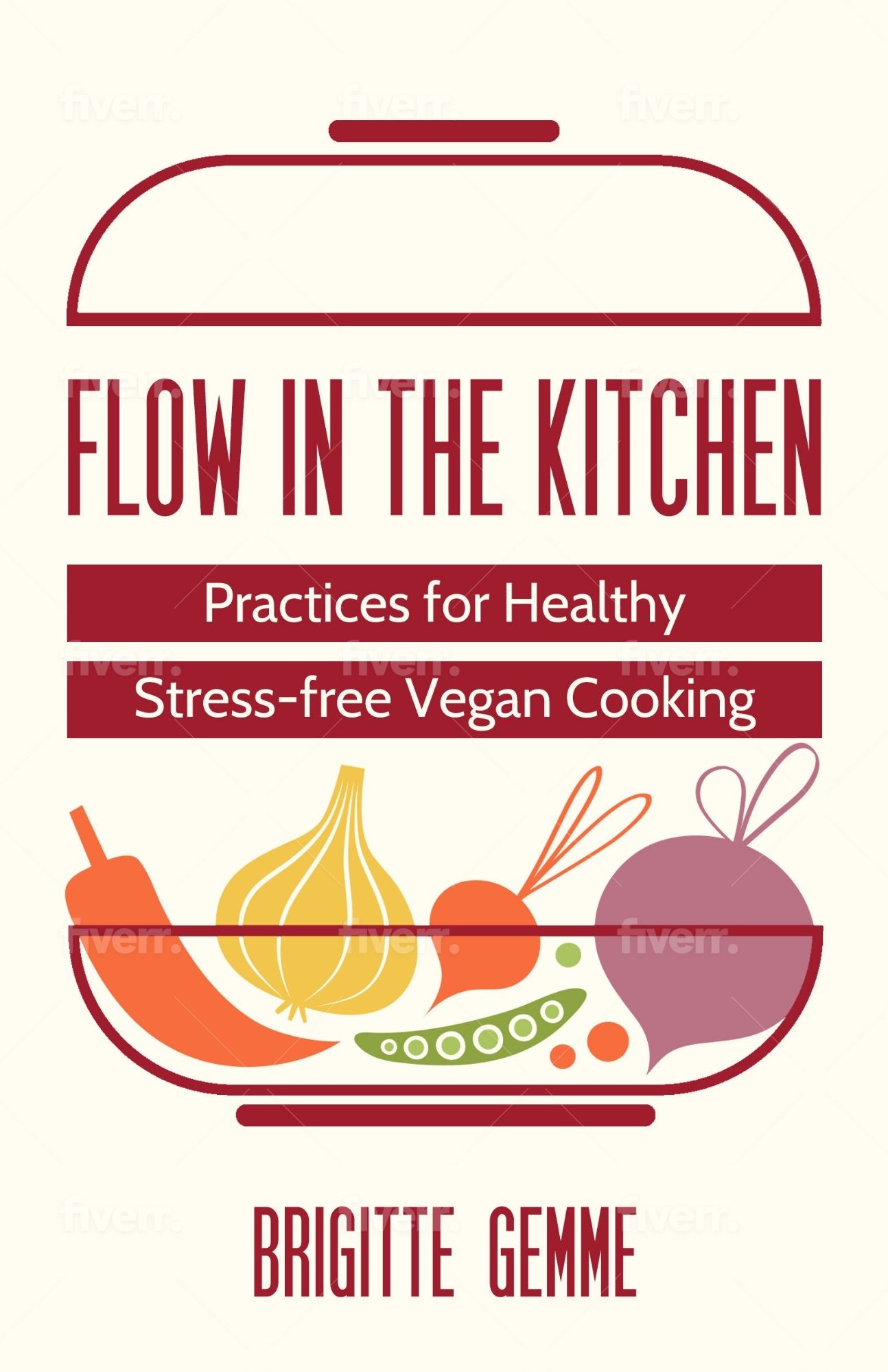
Design 1: Vegetables in pot
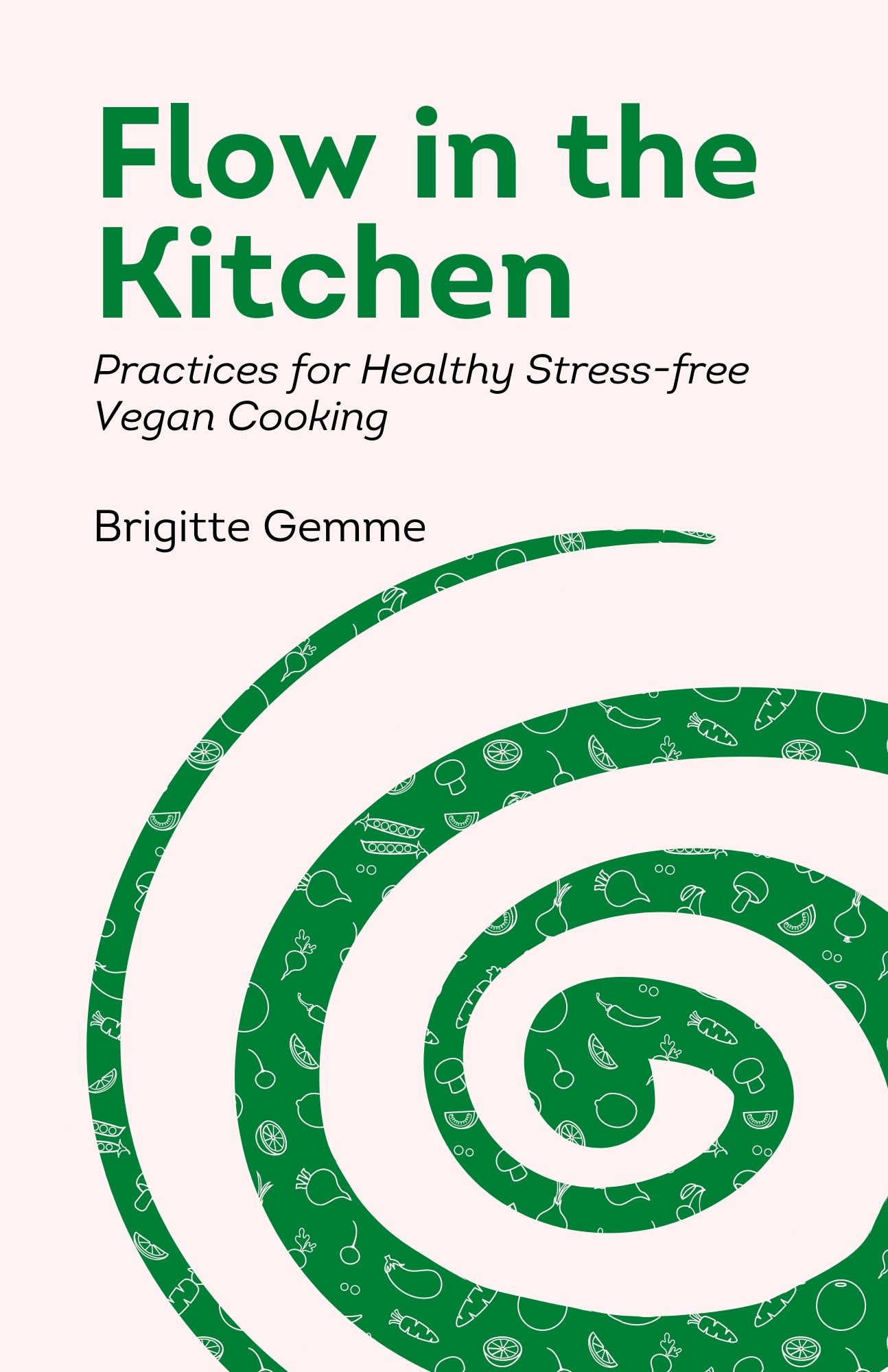
Design 2: Green spiral, text aligned left
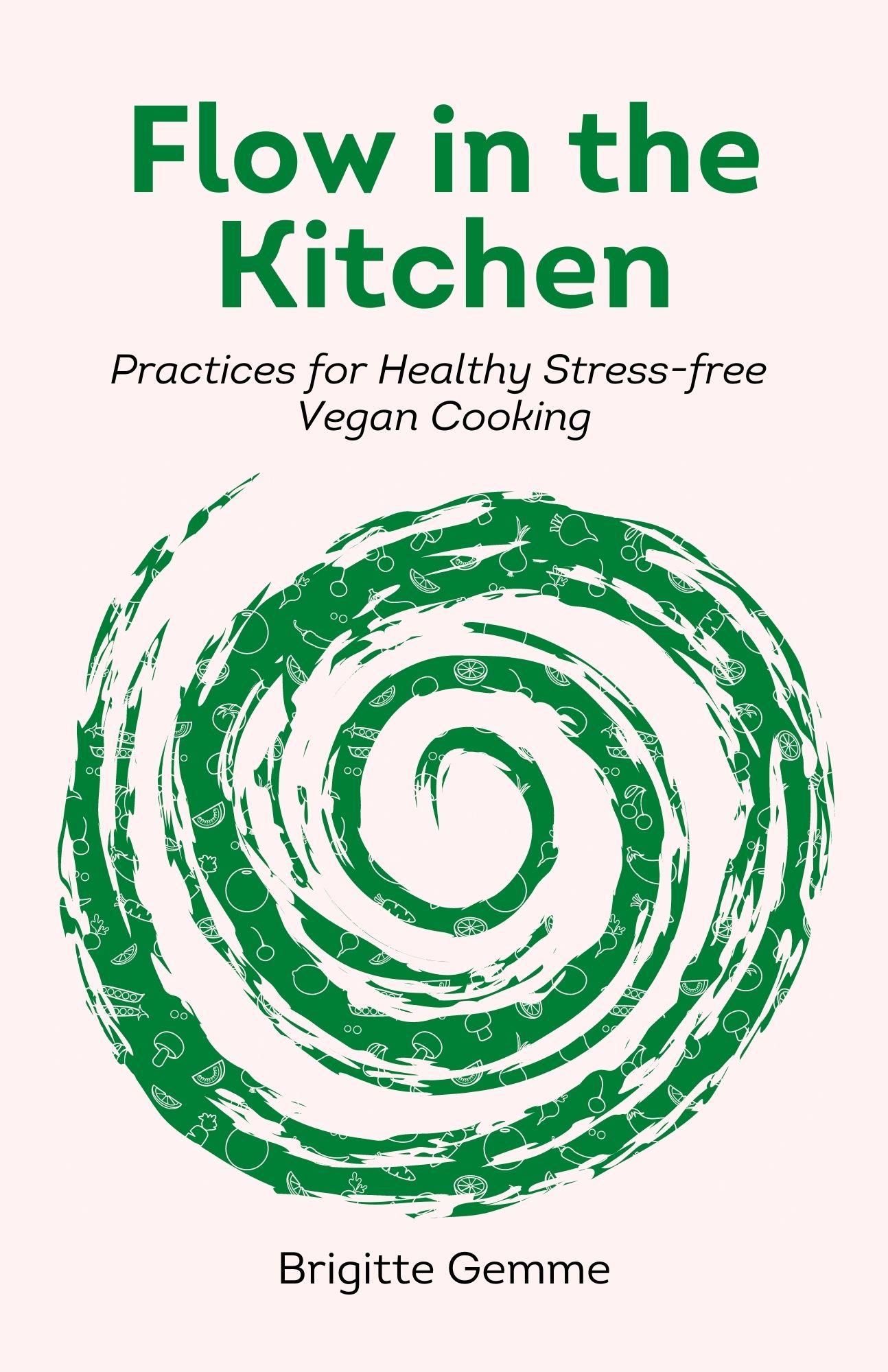
Design 3: Rough spiral with text centered
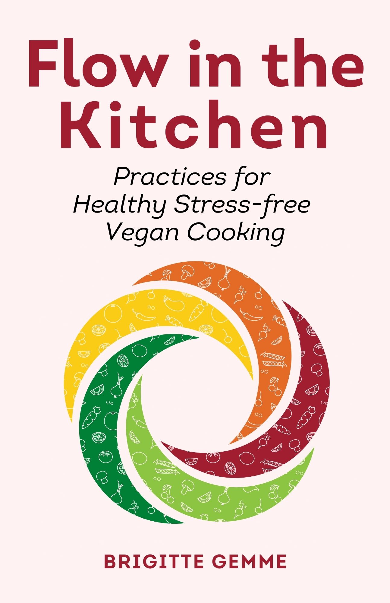
Design 4: 5-color with veg, text centered
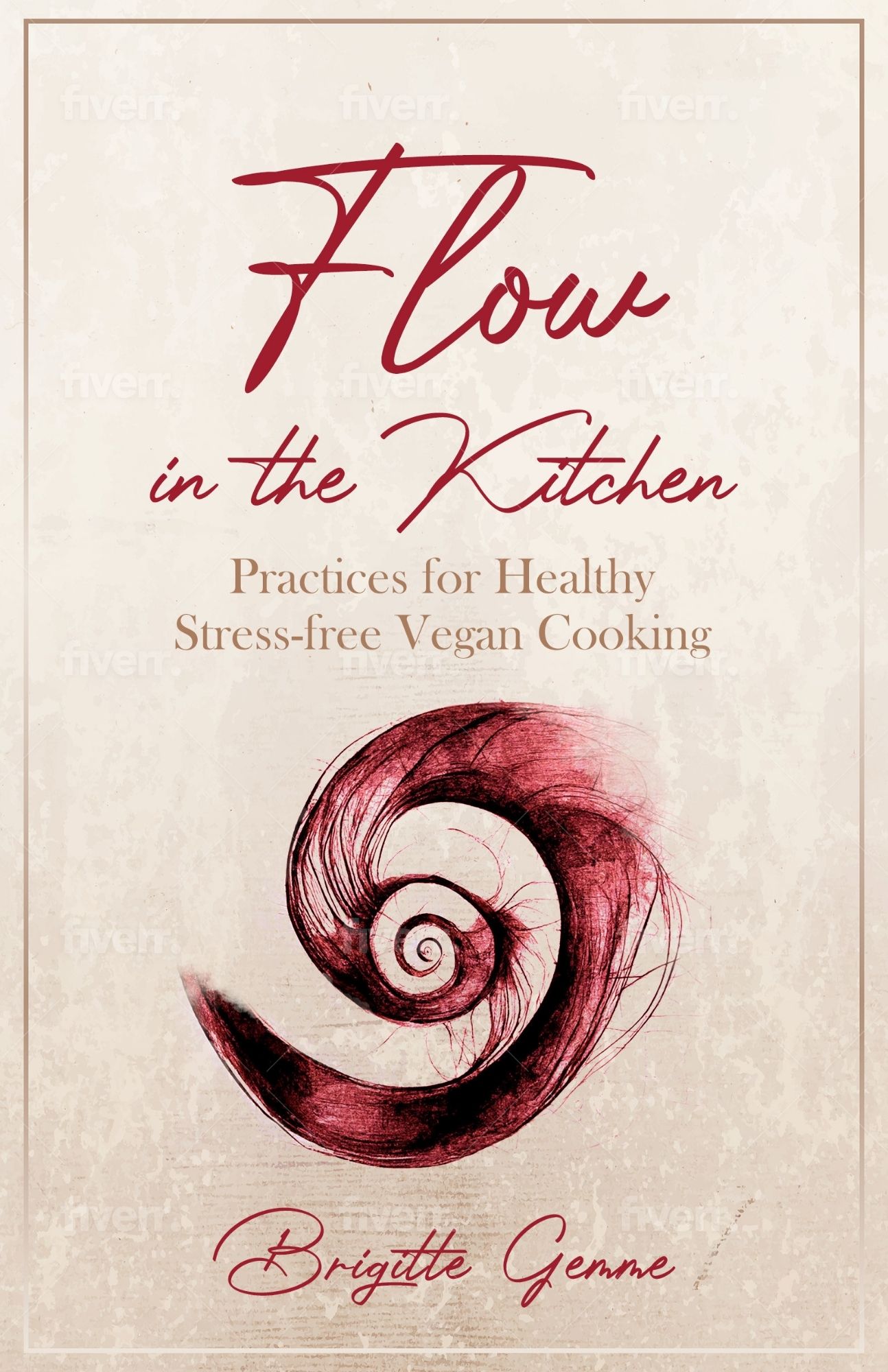
Design 5: Beet spiral

Favorite: #4 Represents the flow concept and the colors stand for a variety of healthy colorful foods.
Next: #2 Good flow
Next: I like the look of #1, but it doesn’t really bring out the flow.
Least favorites #3 and #5. Something about the swirls bother me. #3 seems messy; and #5 seems weird.
Thanks Caryn, I appreciate your comments. Agree that #5 came out of nowhere but I thought I’d throw it in there to see if it was just me. 🙂
#1
Thank you Ann!
Sorry if this is too late Brigitte.
Think I’m out of step with everyone…. I like #2 best, I feel it represents flow in a modern, abstract way & although it doesn’t look like a cookbook the veggies are still present.
#4 is colourful & eye catching in an eat the rainbow way. I think #2 says “flow” more clearly though.
#1 is colourful and clear in a retro style, I’d expect a cookbook inside with those images though.
#3 says whirlwind or chaos to me, might be the reality of my kitchen but not right for the flow philosophy.
#5 is my least favourite graphic – I like abstract but this one takes it a wee bit too far for me, especially with the red coloutinng. I do like the flowing writing!
Not too late at all Gaye! Thank you! Still working on an update, stay tuned.
I love 1!!!! Text easy to read, I love the picture of the vegetables, colorful, and very clear that it is a cookbook. The other covers have text that is harder to read and not clear that it’s a cookbook. If I was in a bookstore I would definitely pick up 1 but maybe pass by the others.
Thanks for the feedback Erin! The thing is… it’s not a cookbook! I should probably be more clear about that right here – will add some comments at the top of this page.
#4! It is the best of the spirals and I like that a lot…it tones down the cookbook expectation a bit. It’s easy to read and colorful.
I also like #1, but I think it veers more than the others toward looking like a traditional cookbook if you really want to get away from that. I will say though that the clarity of the subtitle text on #1 probably does take care of it, and the design as a whole is the most appealing of all of the options.
Thanks Zoe, super useful!
I like designs #1 and #4. The layout for #1 might need a bit of further consideration as my eye went from the title to the vegetables and then back to the subtitle. But I like the vegetables in the pot concept. The fourth one is attractive, eye catching and balanced.
Thanks Melissa for taking the time to leave a comment!
#1 It is clean and implies “kitchen” with the pot and veggies. Second choice would be #4. Not crazy about any of the other three. #5 is lowest on my list as the font for the text is a little hard to read.
Thank you Char, grateful for your feedback!
#4. Maybe with “Before We Cook” on the cover.
My 1st response was,
#1 Definitely! It’s clean, calm, and shows beautiful plants. Now, after reading your added explanation, it’s more difficult, because I would buy the book with #1 expecting recipes. So, maybe claim #1 for your next book, a cookbook. A “Flow” series.
Thanks Evie, very helpful comments!
#4 Hands down! The colors overall are pleasing and eye-catching. The “flow” spiral is bright (eat the rainbow), symbolizes flow and flexibility, while being calm and tidy. Seems free-flowing, yet in control., neat, and infinite – seems to symbolize flow.
#2 next, then 3 – they symbolize “flow” but not as eye catching at #4, and #3 makes me feel a little frantic/stressed.
#1 and 5 tied for last. #1 reminds me of a cookbook … feels rigid to me, like it’s all about slow-cooking or instant pot recipes. #5 looks like a blood-shot eye, although I like that the font seems fluid.
Thank you Marian!
My favorite is number one, but I think number four relates more to the idea of flow. And I like the colour… it makes fow sound like fun!
Thanks so much Inês!
I love #4! It’s crisp and and inviting!